Features
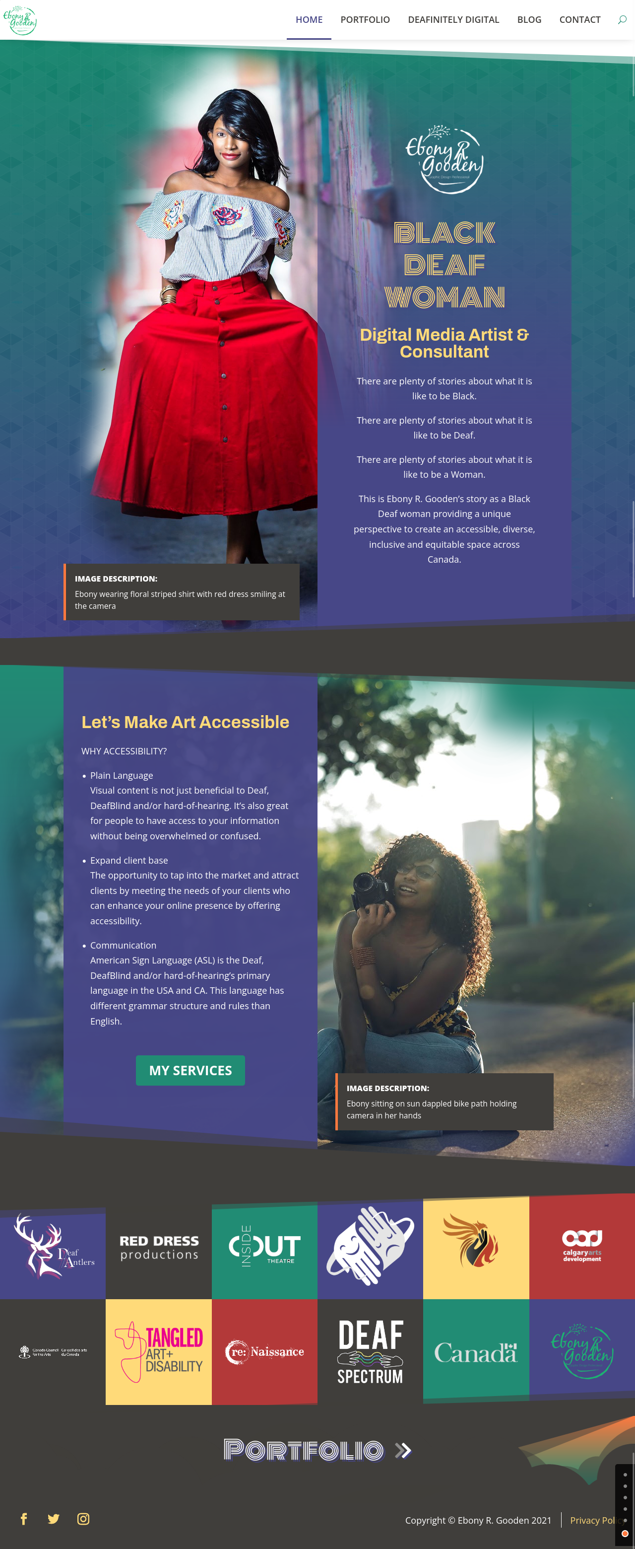
- Responsive web design for smartphones, tablets, laptops and desktop computers
- Custom templates for project and archive pages, Search/404 pages
- Focus on accessibility for users with disabilities and efficiency
- Beautiful landing page design
- Easy input for SEO on each post, page and project using Yoast SEO plugin
Stack
Since Ebony was already familiar with WordPress, we went with that. A lot of websites use it because it’s free to use if you purchase your own hosting and domain. It comes with a ton of features, including the Block editor that allows you to edit your posts easily and save reusable blocks.
I normally use Gulp to use Sass, but in this case, I wasn’t sure whether Ebony would want to have the ability to edit the website to that extent. So plain CSS was used to allow Ebony to go into style.css if she wanted to.
WordPress Theme
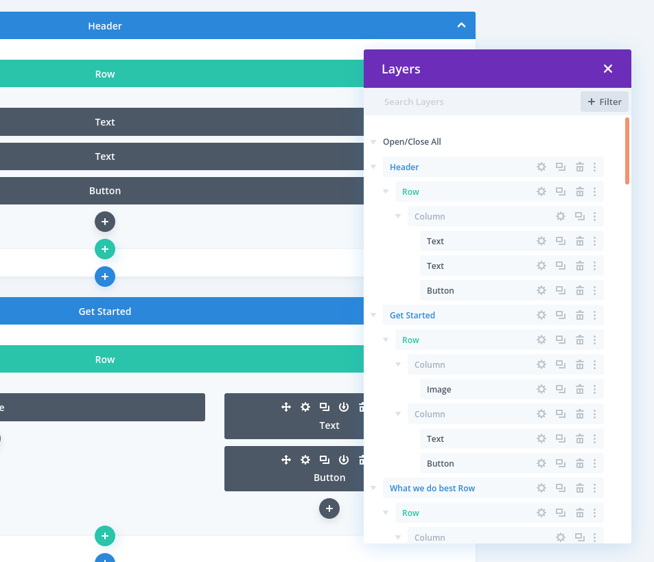
To build the theme, I created a child theme of Divi, a page builder by Elegant Themes. It was important Ebony would be able to edit the website beyond the Block editor in WordPress. At the time of development, the editor was limited to inside the post editor, so users could not edit websites itself. That’s why page builders exist although that’s changing as WordPress gets better for theming with the Block editor.
So we went with Divi for all the good stuff it offers like responsive design, and a robust page builder system with dynamic data options and page conditionals.
Responsive Web Design
Using the mobile first method, I created designs for smartphones, tablets, laptops and desktop computers.
Using the native breakpoints inside Divi, I started with smartphone designs, adding more styling as needed as I worked my way up to desktop computers. This way, I don’t have to design for each display resolution’s media query and can take advantage of the cascading effect with CSS.
Not only websites need to be accessible to all devices and users, search engines will down rank your website if they detect your website is incompatible for mobile devices.
These reasons alone justifies why responsive design is important!
Custom Page Templates
All pages have been customized using Divi page builder. Custom page templates include archives, search, 404 error and posts.
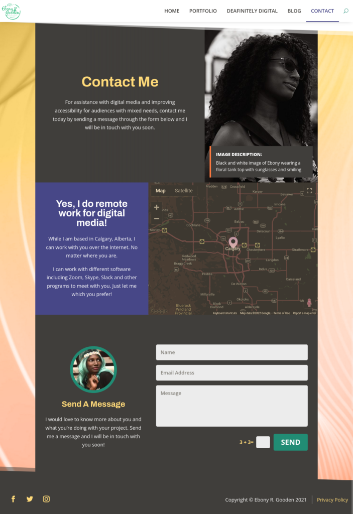
Design features have been used such as unique shaped dividers and colour gradients to give a feel of transitioning through each section as we read through each page.

Accessibility
The website needed to be accessible for users with disabilities. In my design work, I’m mindful of factors that can impact accessibility:
- Font family choices, colour, text and readability
- Focus outlines for keyboard navigation and dot scrolling for page scrolling
- Structural hierarchy for headings and text to improve scanning for sighted users and screen readers
- Use of language avoids industry jargon and information is easy to digest for general audiences
User Navigation
Good user navigation ensure users don’t arrive at a dead end or get confused. On all pages, there are always actions users can take when they reach the bottom of the page.
At the bottom of posts, there are navigational links leading to the next or previous post with an option to return to the blog page.
For pages, there are sections with buttons that take users to the next page, or a specific page that make sense within the context of the page users are on.
For example, at the bottom of the portfolio page, the button sends users to the services page. Then at the bottom of the services page, users can go to the contact page from there.
Gallery


