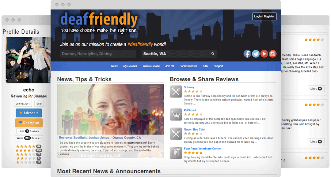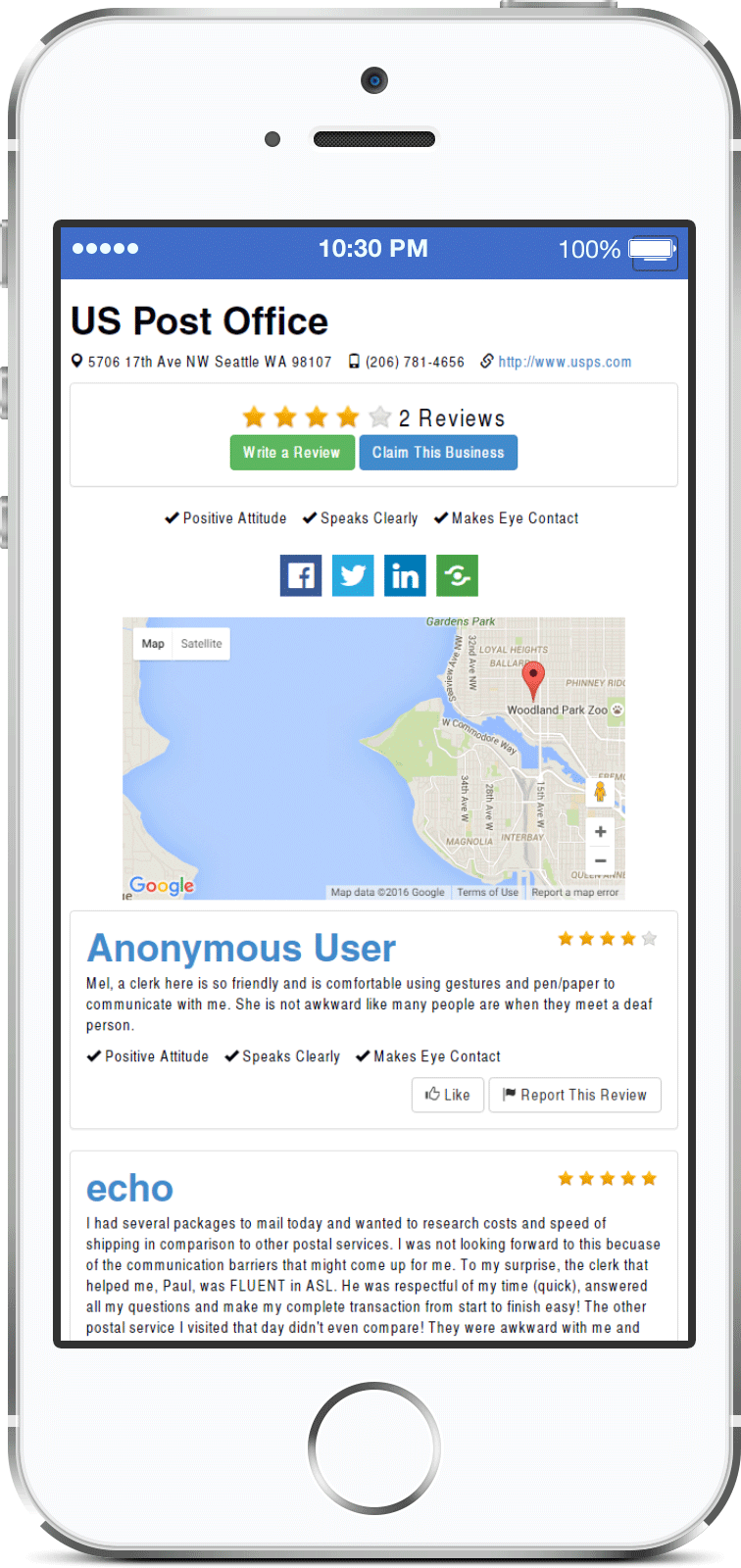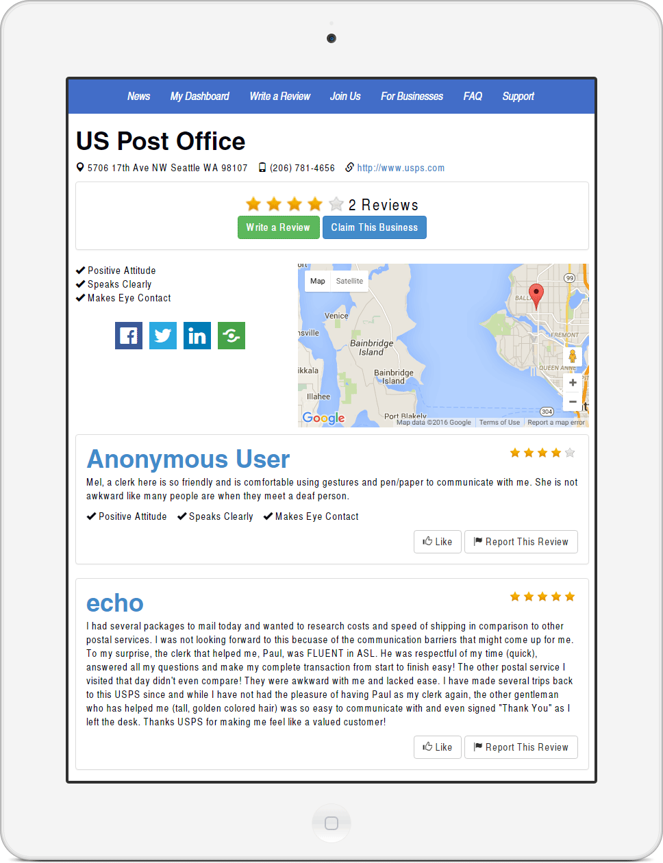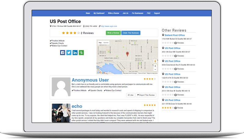
Since everyone uses smartphones nowadays, the design was severely limiting the user base to desktop computer users. Responsive design not only improves accessibility, it is also one of the things search engines look for and impacts how well your website ranks.
Unfortunately, the only way to fix these issues is by integrating the website with responsive design and readjusting the markup code as needed. It can be expensive for businesses who have a budget to consider, but there’s good news. Enter rapid prototyping CSS frameworks.
Working with other developers, we decided to keep the original design and update the structure for different screen sizes using Bootstrap.
Libraries like this are great to use for smaller budgets and allows for rapid development.
I gutted the menu and rebuilt it to play nicely with the homepage header. Keeping the original styles, I added the responsive markup throughout the website including the overall layout for the front and secondary pages like the review pages.

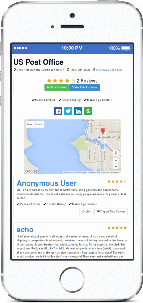
The company saw a big increase in traffic which improved their bottom line and grew their subscriber base. When websites are optimized for smartphones, more people can visit and search engines are happier.
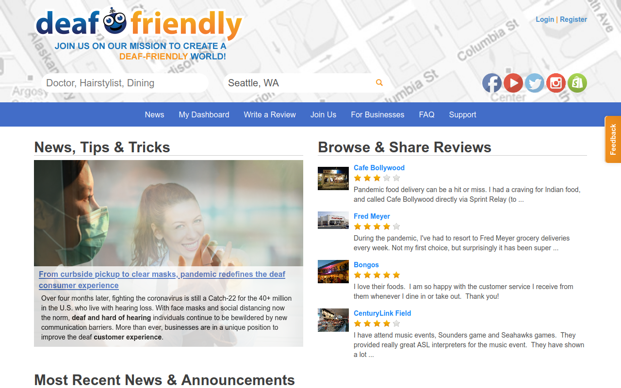
They have since updated their website, so what you see here is a older version where I did the original responsive design upgrade.
Mission achieved!
Gallery


